CONTEXT
Businesses for students, by students
Penn Student Agencies (PSA) is a community of students gaining entrepreneurial experience to provide innovative products and services through 3 agencies: Williams Cafe, The Record, and firstServices.
As the Web Designer, I restructured PSA’s website into a more accessible and centralized hub of information, products, and services for clients.
PROBLEM
Issues concerning navigation and information presentation
After speaking with 10+ stakeholders and conducting a website audit, we identified issues with user flow, visual identity, and cognitive overload. These issues gave the impression of an outdated website or an inactive organization, affecting customer attention and trust.

CONFUSING NAVIGATION
The website featured pages with repetitive information or outdated resources. Many links led nowhere or constantly redirected users.
LEGIBILITY ISSUES
Multiple sections often condensed information or spanned the viewport's width. Several pages contained colors with poor contrast.
BRAND INCONSISTENCY
While each agency had individual branding guidelines, the website style and layout failed to indicate that the agencies fell under the same organization.
APPROACH
Layout patterns of student agencies
To guide the website development, I researched other university student agencies and their websites to find common themes in site architecture, information hierarchy, and visual style. These insights informed early versions and highlighted which website functions to prioritize.


Efficient
Accessible action items
Filter products or services by commonality
Summarize information or redirect to a detailed view if needed
Personable
Populate pages with photos and videos
Updated contact information, location, hours
Feedback screens for complete forms
Accessible
Clean interface design
Recognizable page layout that can be mirrored across brands

INFORMATION ARCHITECTURE
A simplified sitemap helps customers easily understand the website's functions during their initial visits.
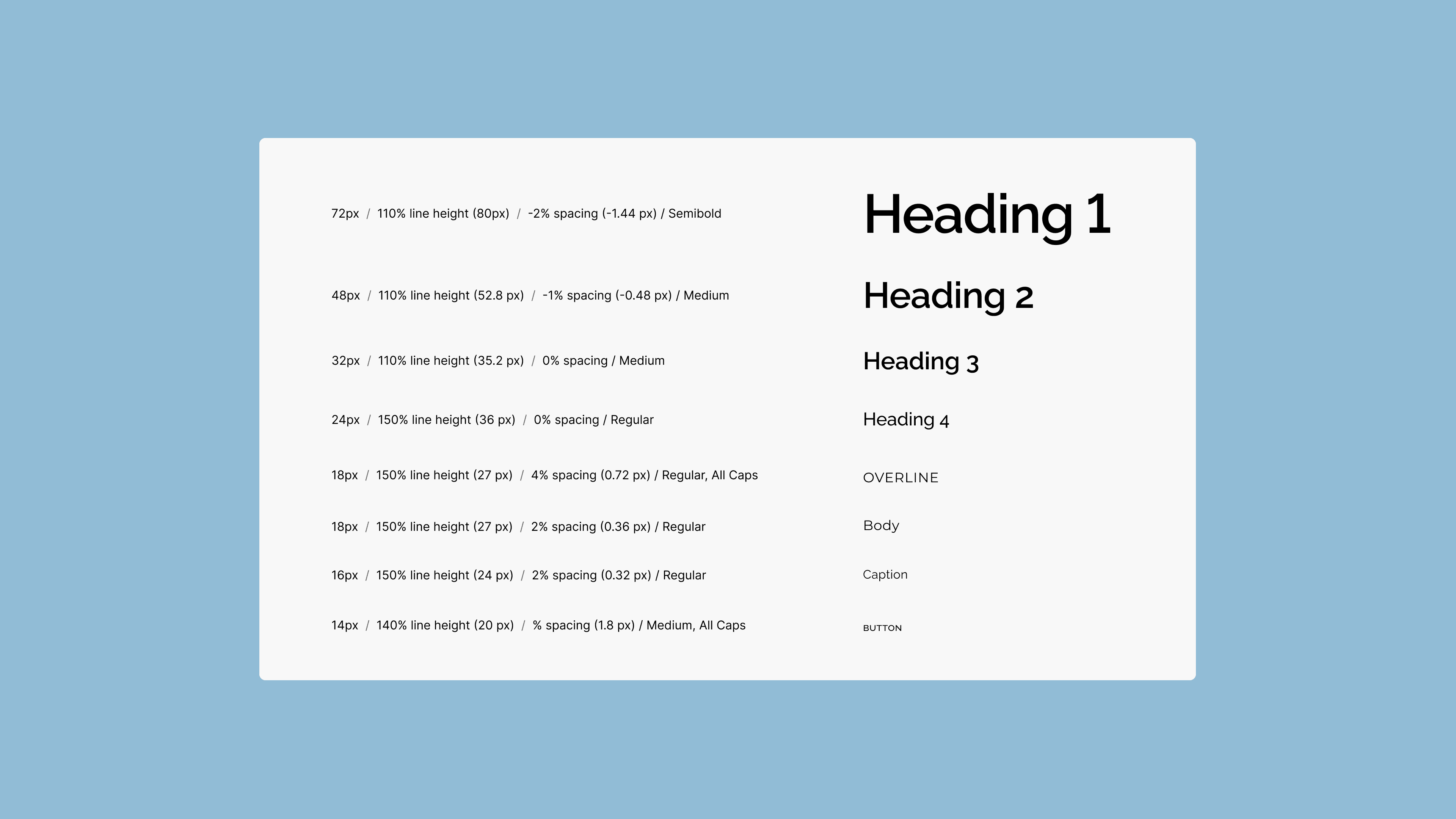

DESIGN SYSTEM
The atomic design system works with each agency's individual branding while ensuring consistency across pages.
CALL TO ACTION
Customers are greeted with immediate action items that likely suit their needs. Additional services, offerings, and ways to get involved populate throughout pages for easy access.

FORMS
Forms for contact, inquiries, requests, and purchases are consolidated on the website, making essential data easier to track and update. Submitted forms are automatically sent to the agency managers.

SHOP
Items are ordered and filtered so customers can quickly find the product they need.
IMPACT
Creating less friction in accessing resources
Each webpage has a recognizable and dependable structure that minimizes visits to external sources and maintains a smoother navigation flow.
INSIGHTS
Far from a cookie-cutter process
I started this job as the sole web designer while taking my first course on UX/UI design. While I was excited to apply my lessons on best design practices to this project, I quickly discovered how difficult it was to apply the “perfect” traditional product timeline.
If I had another chance, here's what I would do differently: